In this post, I am giving some examples on how to improve the website navigation of a favorite travel provider of mine, Lonely Planet. I love their offerings and spent some time ideating over what would make their website structure even more user friendly.
For the overall IA, I propose the following structure which reduces existing redundancies and cleans up some inconsistent terminology in the existing structure.

Home Page
There are multiple problems with the current home page, such as too many navigational choices. There is a menu strip in the header and then there are three rows of 8 tiles in each row for additional navigation in the lower half of the home page. The images are all looking very similar and don’t help with navigation on those tiles. Ads are displayed too prominently. The footer shows the entire navigational structure, but just adds to the duplication. Logo and Search are switched in the header. I find it strange to place the search in the upper left corner of the header where you would normally see the logo.

Home Page redesign
Here is a redesigned home page in rough wireframe format. I focused on the following aspects of this site:
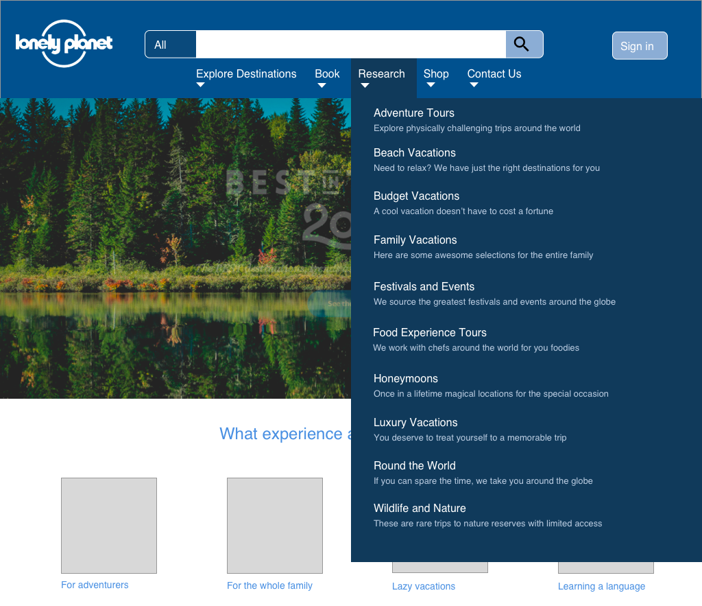
- A clear menu structure in 5 categories, Explore Destinations, Book Research, Shop, and Contact Us
- The logo is now on the left, and the search box is in the middle, and it can function as a filtered (faceted) search as well.
- Ads are organized in a “Partner Deals” section, next to “Special Offers” that are offered by Lonely Planet.
- The tiles on the home page are focused on the top experiences that people come to the site for and book most travel for via Lonely Planet. The types of tiles displayed here would get modified based on analysis of actual usage data.
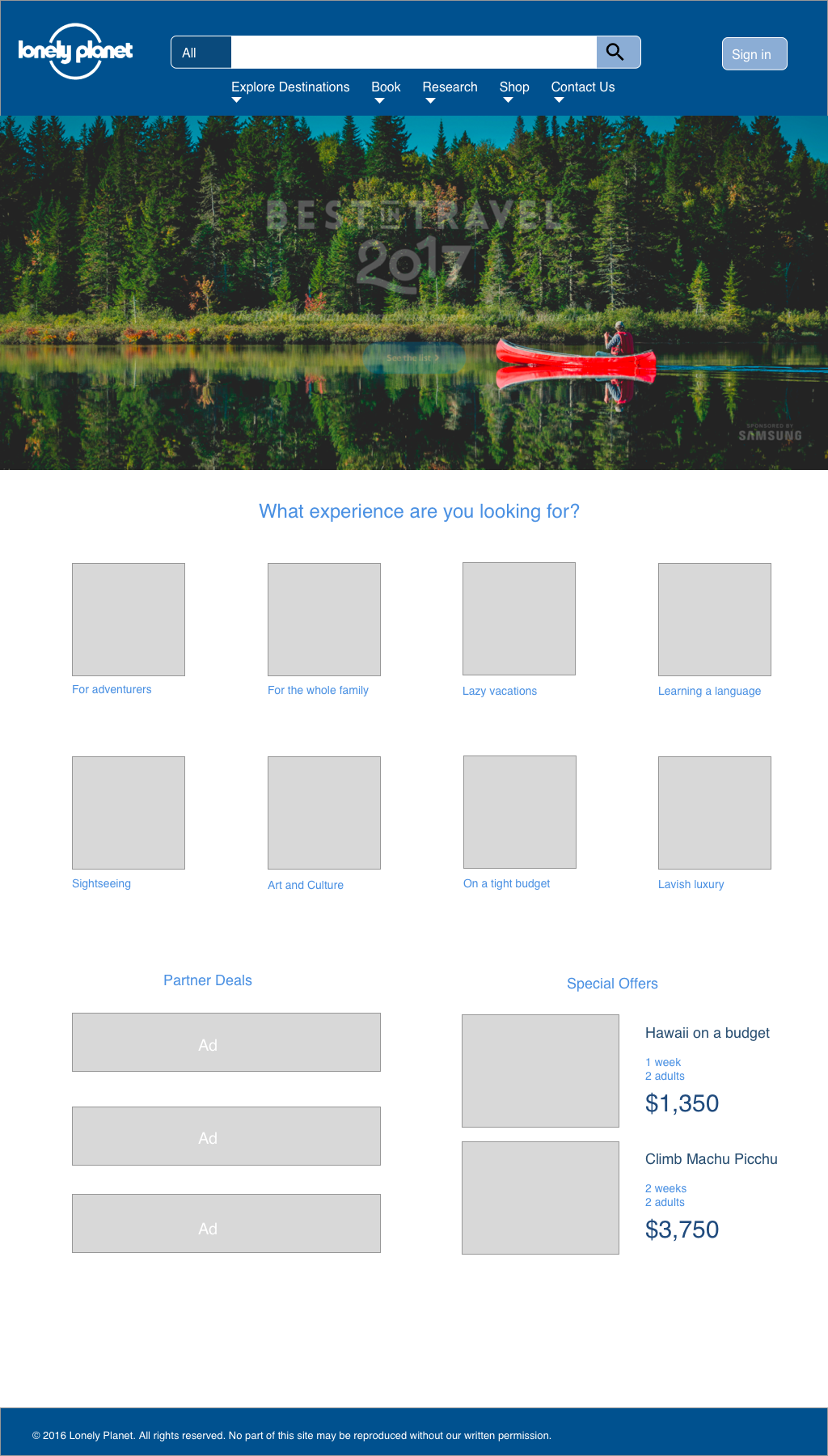
- Drop down menus are not just one-word menus, instead there is a title and a brief description underneath.
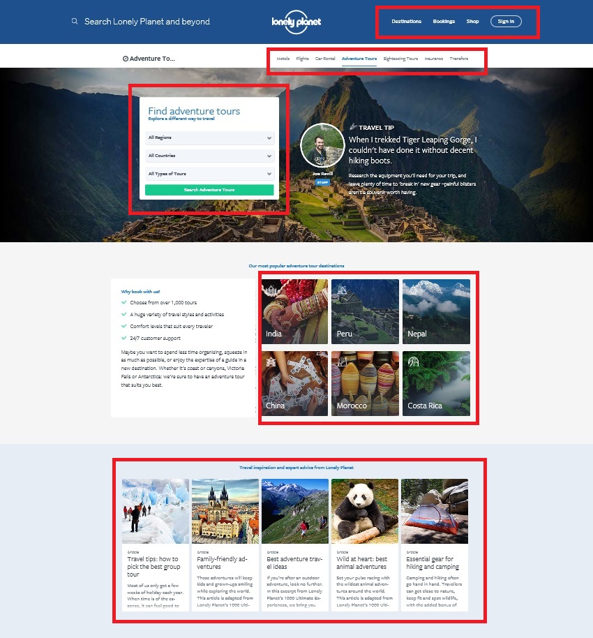
Section Adventure Tours
Let’s imagine we clicked on “Adventure Tours” on the previously shown drop-down menu under “Research”. By the way, if drop-down menus bother you, you are not alone. Watch this hilarious presentation by Golden Krishna and Eric Campbell from South by Southwest (SXSW) in 2016. It’s worth it!
Back to the Adventure Tours section under LonelyPlanet.com. Here are some of the navigational problems I noticed, see the red boxes. In short, too many nav choices! Some are just redundant.
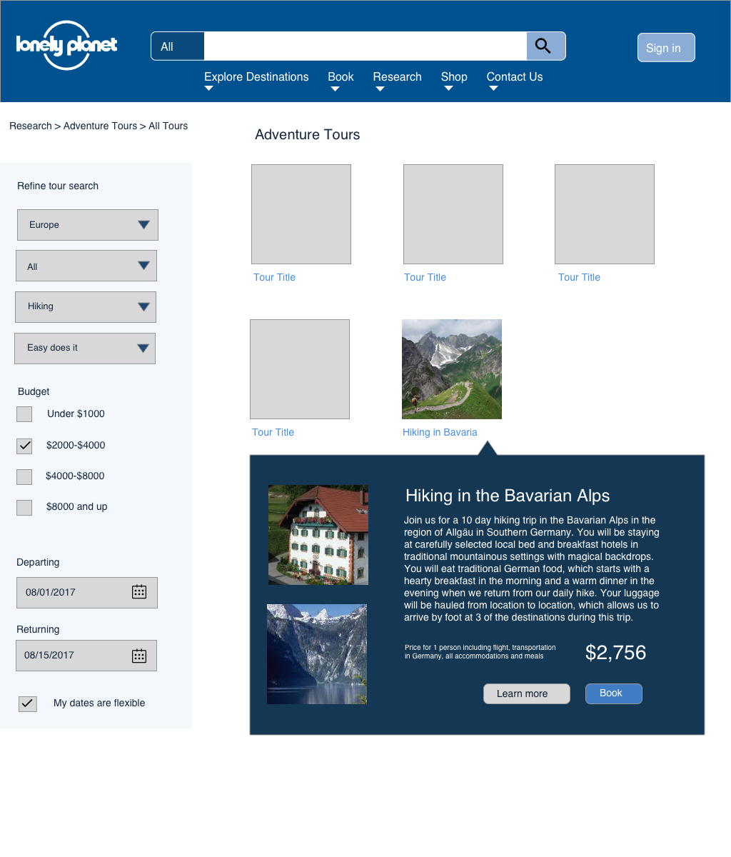
The proposed new design adds:
- A clear section to refine search parameters on the left of the search results
- A breadcrumb bar at the top allowing the user to always know where they are and quickly navigate back to a higher level section
- A textual description of what this section is about, which was missing in the old design.
- Filters for skill level, dates and budget, which were missing in the old design at this level.
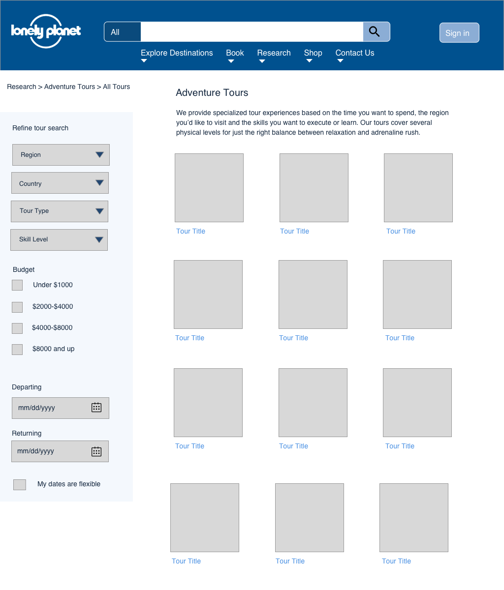
We all need to learn from Amazon.com, they have it down. Thank you, Amazon, for your amazing information architecture!
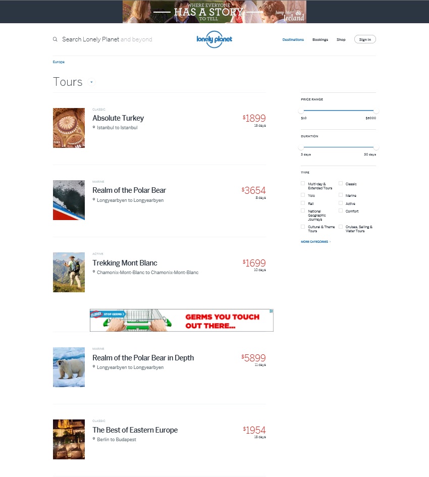
Section Adventure Tours: Quick glance for search results
The current design at LonelyPlanet.com offers the filtered result set in a list view with too much white space – you can only see 5 results and 2 big ads again (which are not placed optimally either). Here is what the current design looks like:
Imagine, we selected Europe for Region, then Germany for Country, then Hiking for Tour Type and Easy does it for Skill Level. The resulting set of options initially displayed in a list of tiles offer a quick glance panel that allows the user to learn more without having to navigate to another page. This saves clicks and allows the user who is still browsing around to get a lot of quick information in a short amount of time, without getting lost. In this new design, you can easily see at least 12 results (if that many are returned after you filtered, which is not the case in my wireframe), and then quickly get more information on hover or click, without leaving the page.
Any of these improvements would lead to a much more pleasant usability of http://www.lonelyplanet.com.
That’s it for today as far as musings over information architecture goes, I hope you enjoy this post!